The Master Bath of My Dreams! How Sarah Designed Her Master Bathroom.
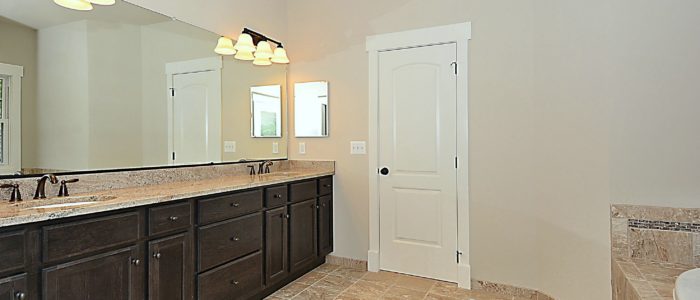
I’ve always dreamed of having a spacious, spa like Master Bathroom with a vanity. Oh, a vanity! I’ve always, always, ALWAYS dreamed of a vanity. Even when I was a little girl I loved doing my hair and makeup, and I wished I had a special place to get ready.
In our old house, we had two small bathrooms. The shower I used was one of those old, yucky plastic showers that closely resembled a shower you might see on a ship. Not a nice cruise ship. Like a sailboat. The bathroom not only was yucky but lacked storage and had zero counter space. And whenever I’d use my blow dryer and someone else used the toaster, I’d blow a fuse.
Nice!
So not spa like!
When we were building our home (a Penrose Model), Dan and I both wanted to prioritize the bathroom. Like Jen, we wanted space, functionality, and privacy (well, we have three young kids…so privacy…at a minimum! Jen, can you build be a SheShed?!). Of course, I also wanted it to feel luxurious.
Want to see how I designed my bathroom? Come on in!
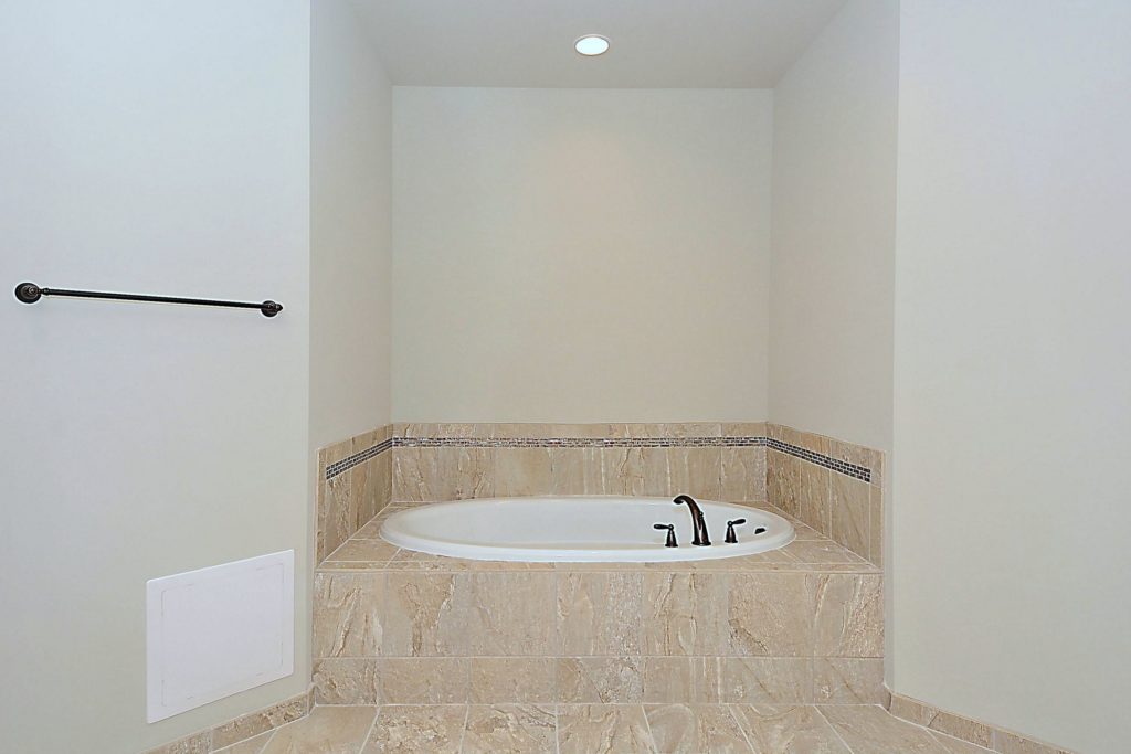
The Tile
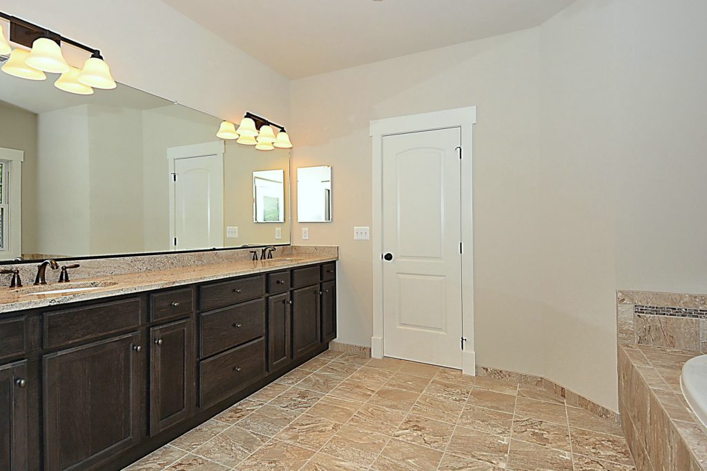
I opted to use the same tile on the floor, in the shower, and around the tub. I picked this tile because as Dan and I were making our selections, Jen was finishing up one of her latest spec homes, a Clarendon Model in Falls Church. I fell in love with the Master Bathroom. She picked tile in the color Snow and a glass listello for the shower and tub surround. As soon as I walked into that bathroom, I texted her, and I said I loved that tile so much that I wanted to lick it!
HA!
Have you ever felt that passionately about tile? Then that’s the tile for you!
I love it because it’s light colored (we only have one window in there – more on that later.) and feels like a spa. So serene and soft. But it’s also neutral.
The Shower
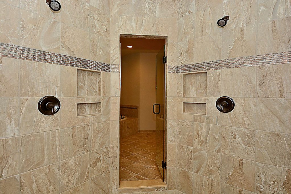
Anyone who visits our house laughs when they see our shower. Yep. It’s pretty big, bigger than the Penrose floor plan (we enlarged it). After years of showering on ship-size showers, we wanted a big, BIG shower. And that’s what we got! I love the rain head and the two other separate shower heads. It feels so nice! I also love how big its because I have three kids, and I can put them all in there to shower at once. #winning
The Tub
In addition to dreaming of a vanity and a big shower (I have a lot bathroom dreams!), I wanted a soaking tub. I teach group fitness classes and work out a lot, so I’ve got a lot of achy muscles. Plus, remember how I have three kids?!
I wanted a big, comfy, soaking tub, and we also opted for the jets. I love this tub. I don’t get to use it as often as I’d like (did I mention I had three kids?!). But whenever I do, I just soak it up! I get my Epsom salts going, some lavender oil….ahhh….
The Vanity
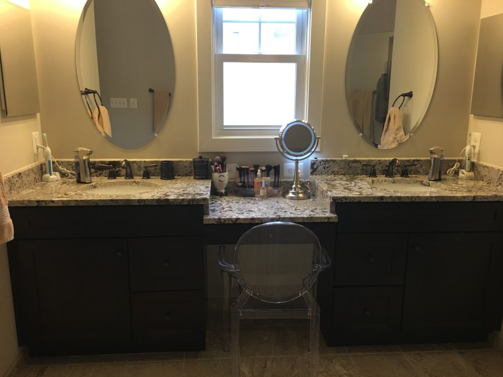
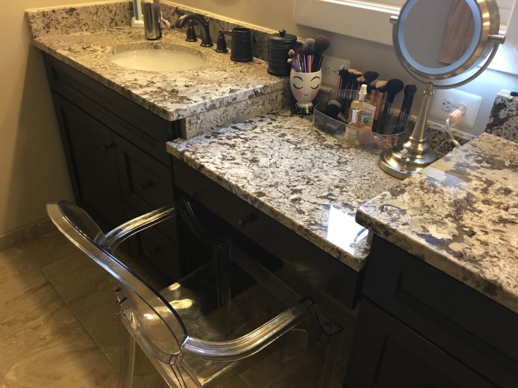
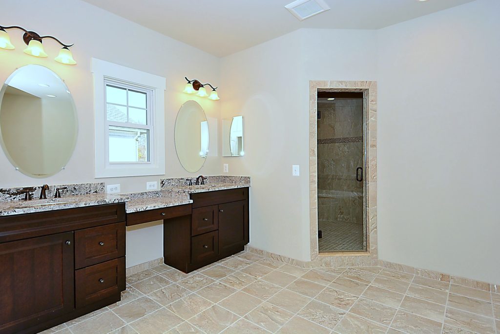
According to me, the key to a happy marriage is either 1) separate bathrooms or 2) separate vanities. Our bathroom is big enough to accommodate a nice long vanity with two sinks and a makeup/hair doing area. That makeup area isn’t in the original drawings. We took a few feet out of Dan’s closet (Sorry, I’m not sorry, Dan!) to create that area. On our plans, I specified I needed two sets of outlets there. I want to be able to plug in my hair dryer, make up mirror, flat iron, etc…
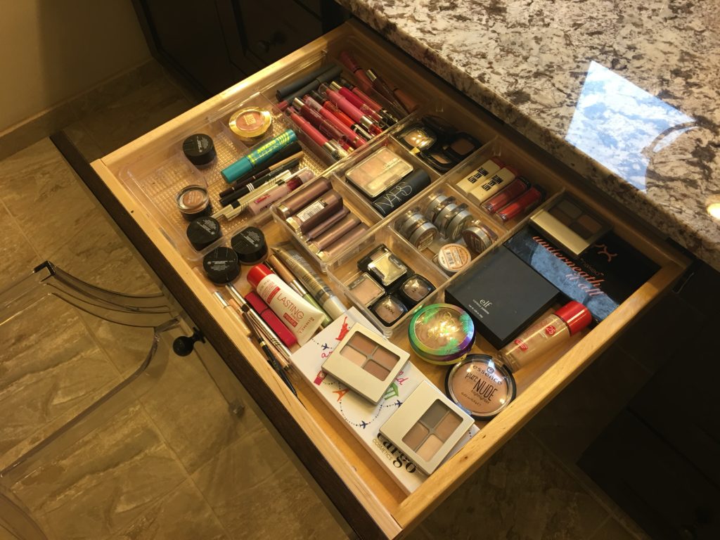
I also have a long, skinny drawer under the makeup are for my, well, makeup stuff. And do you like my chair?! It’s a ghost chair I got on Amazon. I love it. It’s comfortable and easy to clean and can withstand the humidity of the bathroom.
The Window
This window wasn’t in the original plans. The only window in the original plans is the window in the commode room. Jen and the team worked with me to get another window in the bathroom. We talked about swapping the tub and vanity areas, but I expressed how important that vanity was to me, so we found another way.
This is why I loved working with NDI: they listened to what was important to me, and they got me what I wanted. We all searched around on Houzz and came across the idea of putting the window above my vanity area. The team pointed out that I couldn’t put a mirror there if we put in a window, but I told them that was fine with me because I wanted a moveable mirror I could pull close to me for makeup application. (The team learned a lot about my grooming habits while making this bathroom! Thanks, Team!)
I love how it turned out, and everyday I’m glad we put in that window!
I’m so happy with my bathroom. I’d still love to add more decor, like something really pretty over the tub. What do you think? A piece of art? Or a pretty sunburst mirror? It’s a big wall, so it’s got to be substantial! I’m all ears!
