The Clarendon Model in Falls Church: What I Love About This Home
We are getting ready to turn the keys over to the new owner of our Clarendon Model in Falls Church. As always, I’m both happy and sad to let this home go. Happy because I’m thrilled for the owners – they are so excited to move in. But sad because I am going to miss this home!
As I did when we sold our Langley Model home, here are the design features that have me so enamored with this home.
#1 – The Kitchen
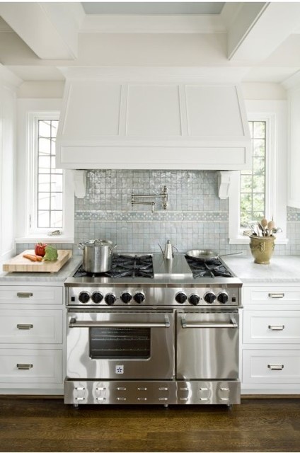
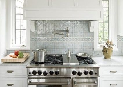
I recently shared why we chose to build the Clarendon Model for this project. I also confessed to not loving the kitchen in other Clarendon Model specs because the space felt so dark (and even a little outdated). So when we were planning this project, I knew exactly what I wanted. To help communicate my vision, I showed this picture to our team as inspiration.
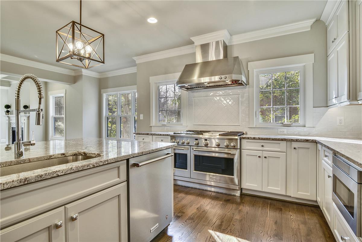
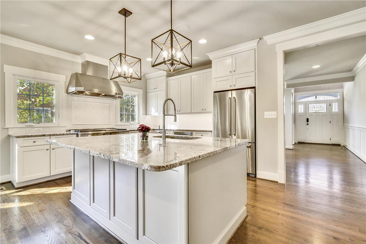
With a slight reconfiguration of the kitchen, we were able to bring in more light and give it a more modern feel; just by moving the pantry and adding some windows.
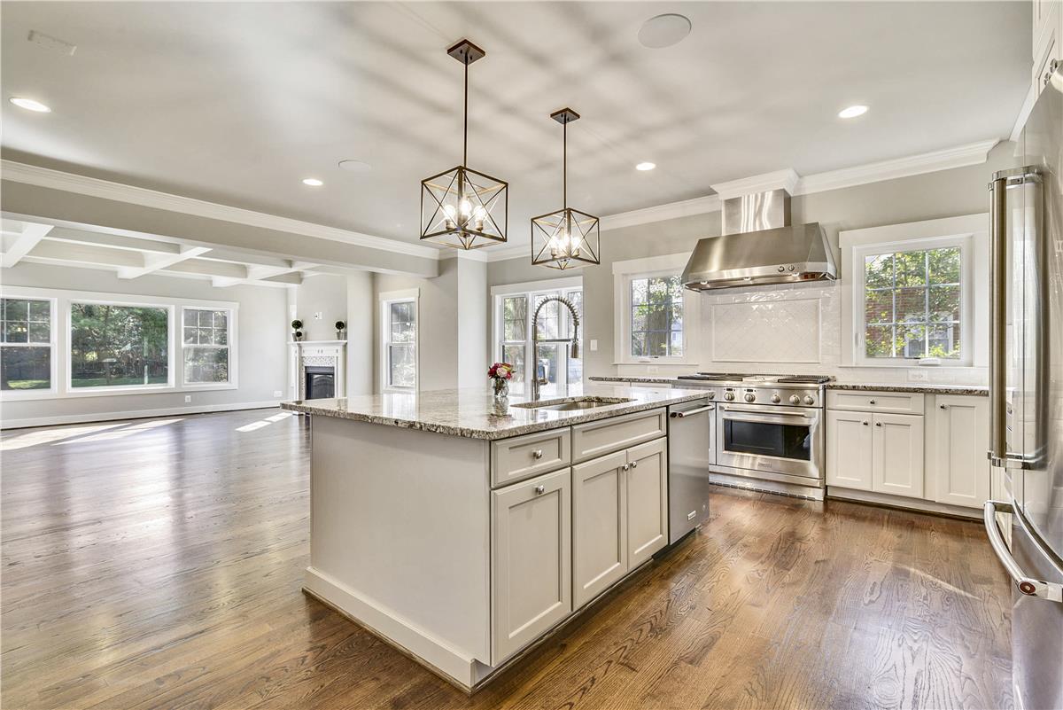
And I think our team hit it out of the park…
This is by far my most favorite kitchen we’ve installed in a spec home. It is filled with natural light and it so functional. Standing in this kitchen makes me joyful (and it makes me want to cook something)!
#2 – The Dining Room
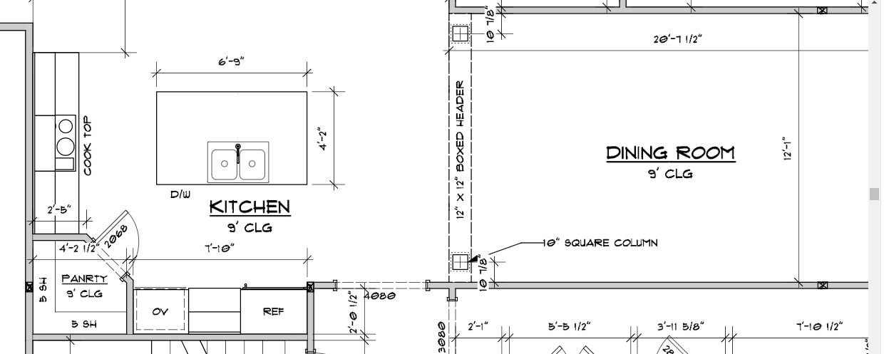
To address the natural light issue in the kitchen, we relocated the pantry which ultimately changed the design in the dining room (for the better!). As you can see in the original design, the pantry is tucked into the corner of the kitchen and the dining room is HUGE.
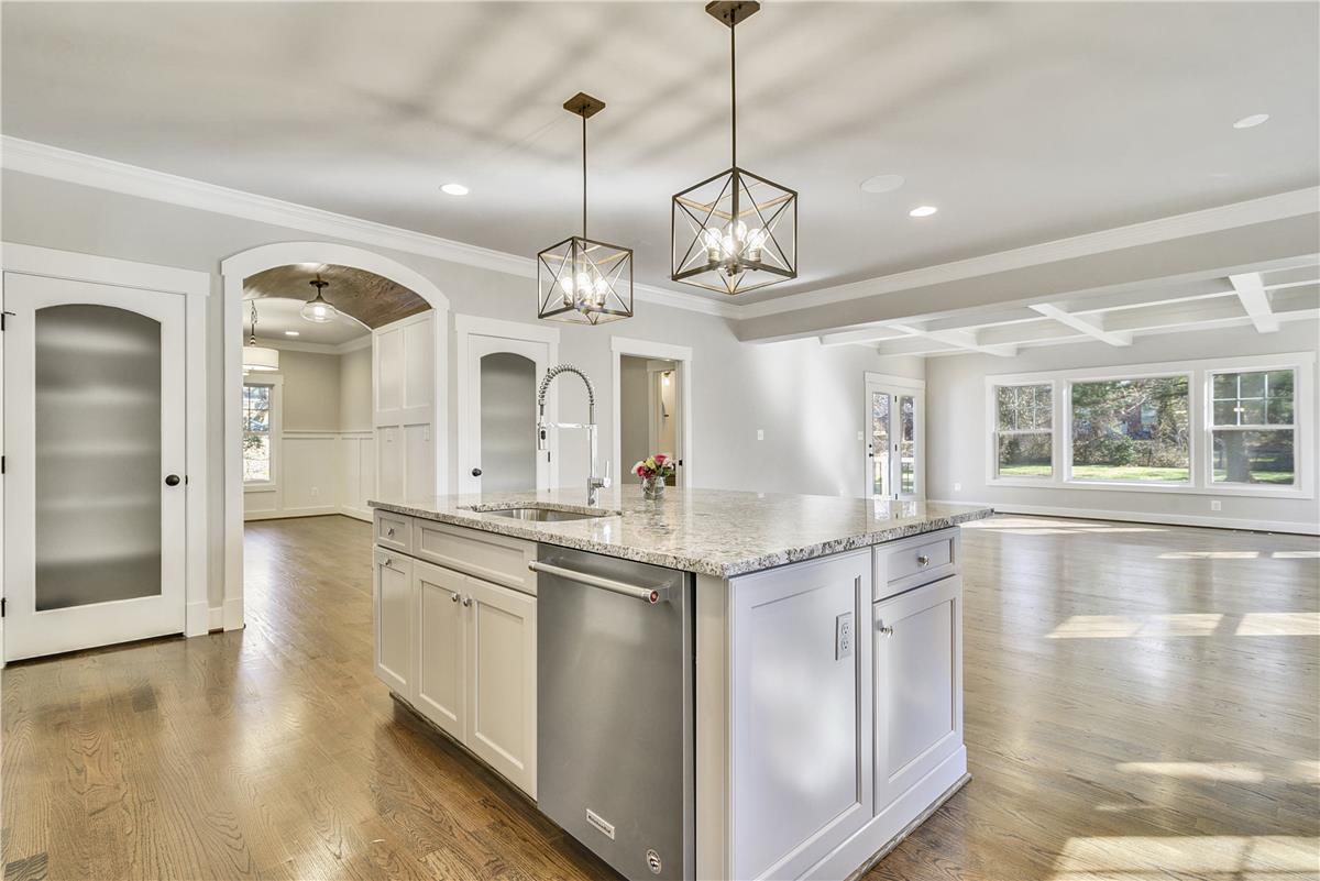
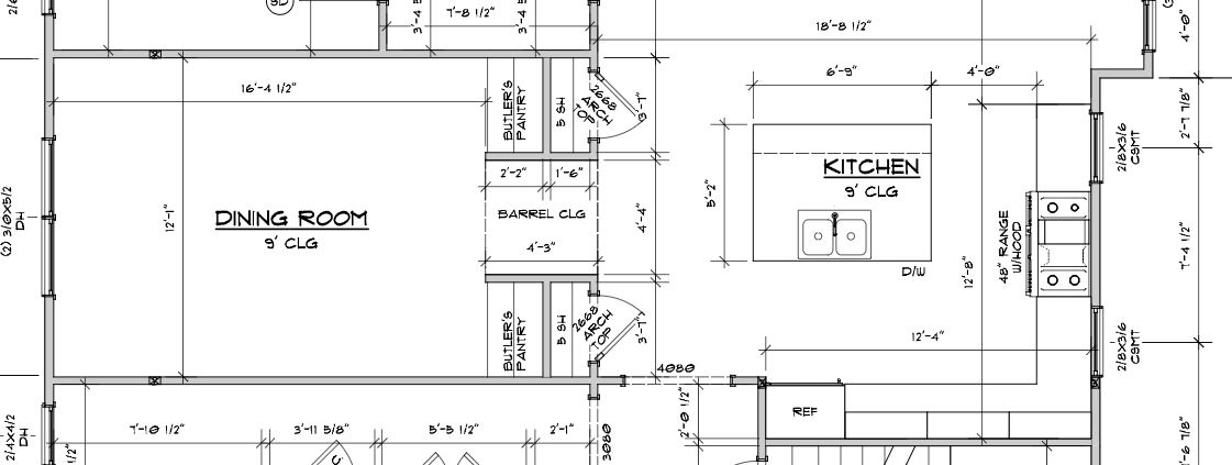
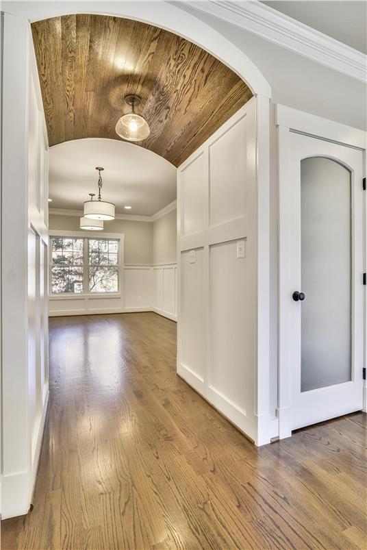
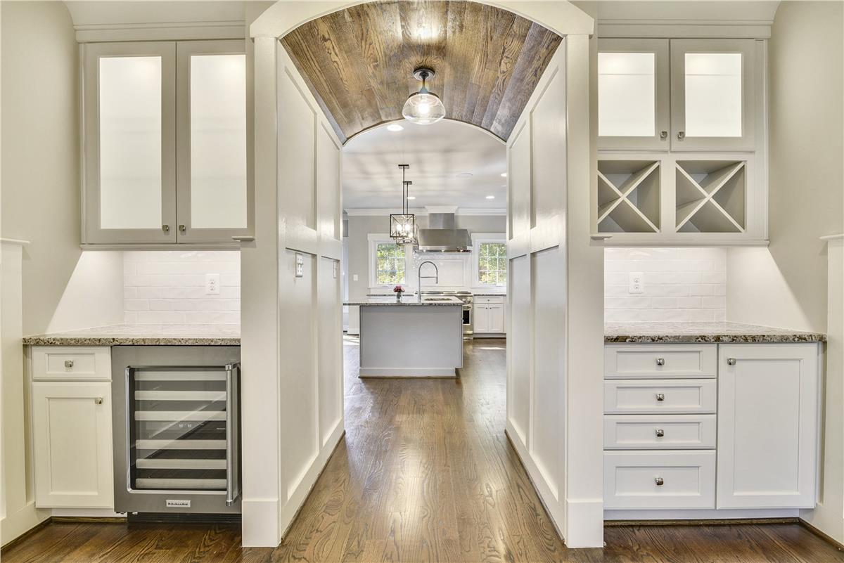
So we decided to split the pantry into two separate pantries to create a barreled ceiling passageway into the dining room. We also added flanking butler’s pantries inside the dining room. Here is the revised layout.
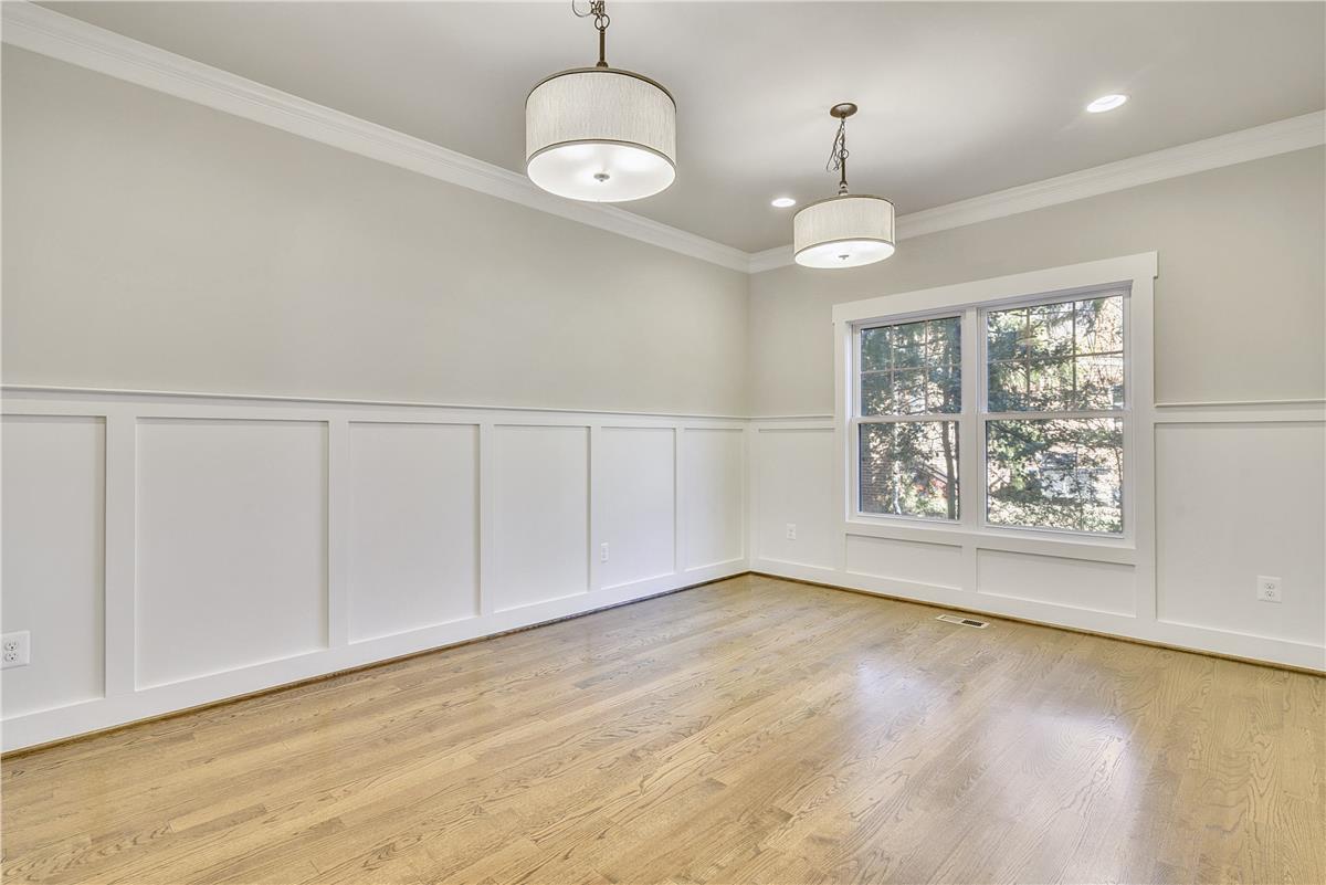
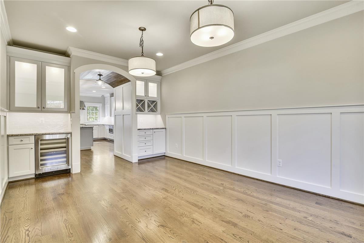
And this is how it turned out…
The dining room is still a very good size (16×12) – perfect entertaining space!
Oh the dinner parties I could host here…
#3 – The Owner’s Bathroom
You’ve likely heard me say this before, kitchens and owner’s baths sell homes. If you invest in upgrading any part of your new custom home, make sure it starts in the kitchen and the owner’s bath. When buyers are looking at homes, they are of course looking at the home in its entirety, but the focus will always be where they spend the majority of their time – in their kitchen and their bathroom.
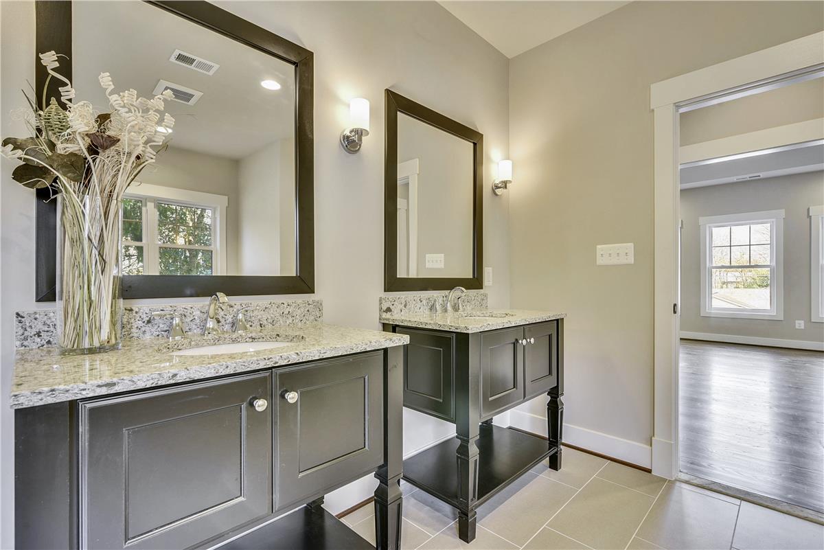
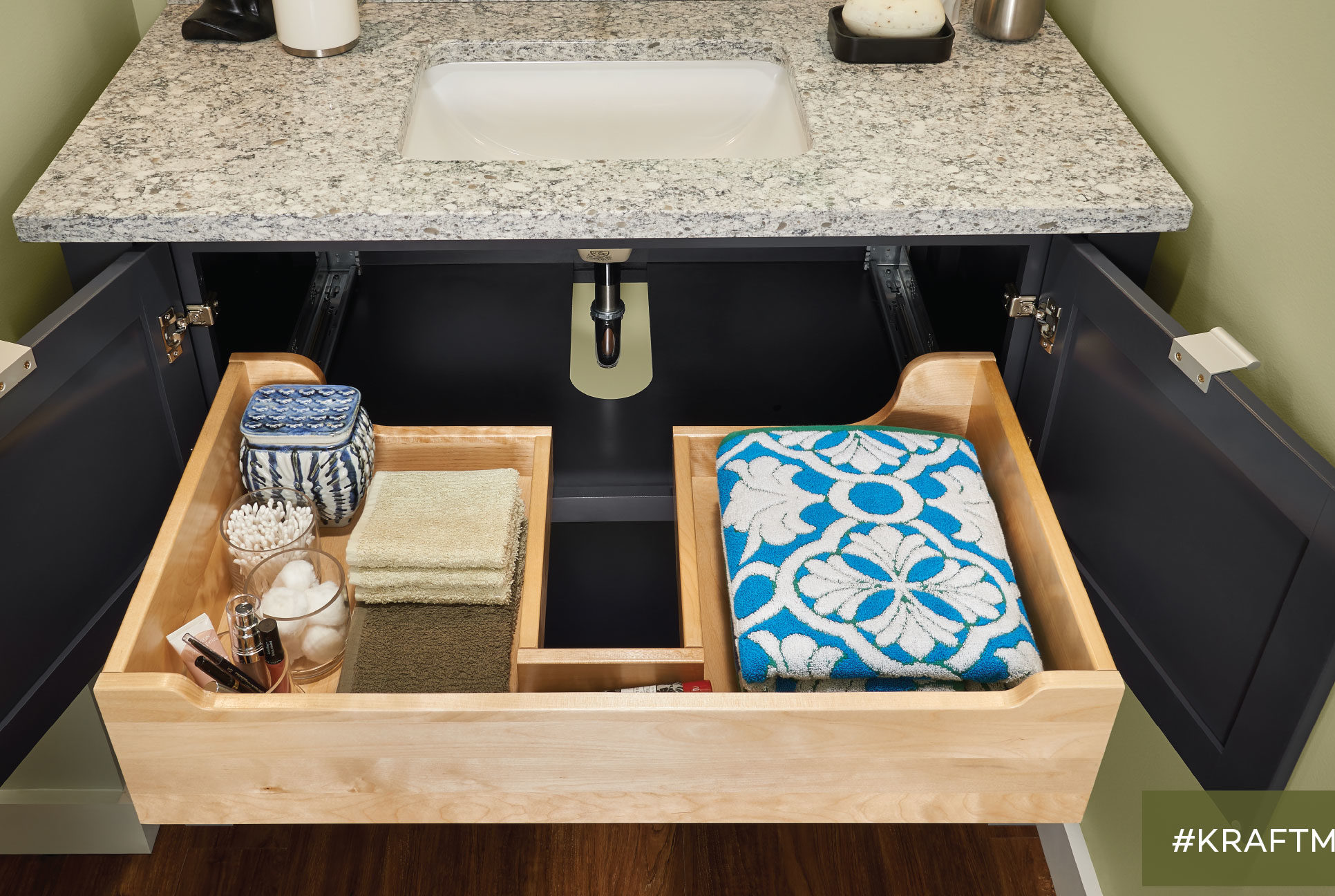
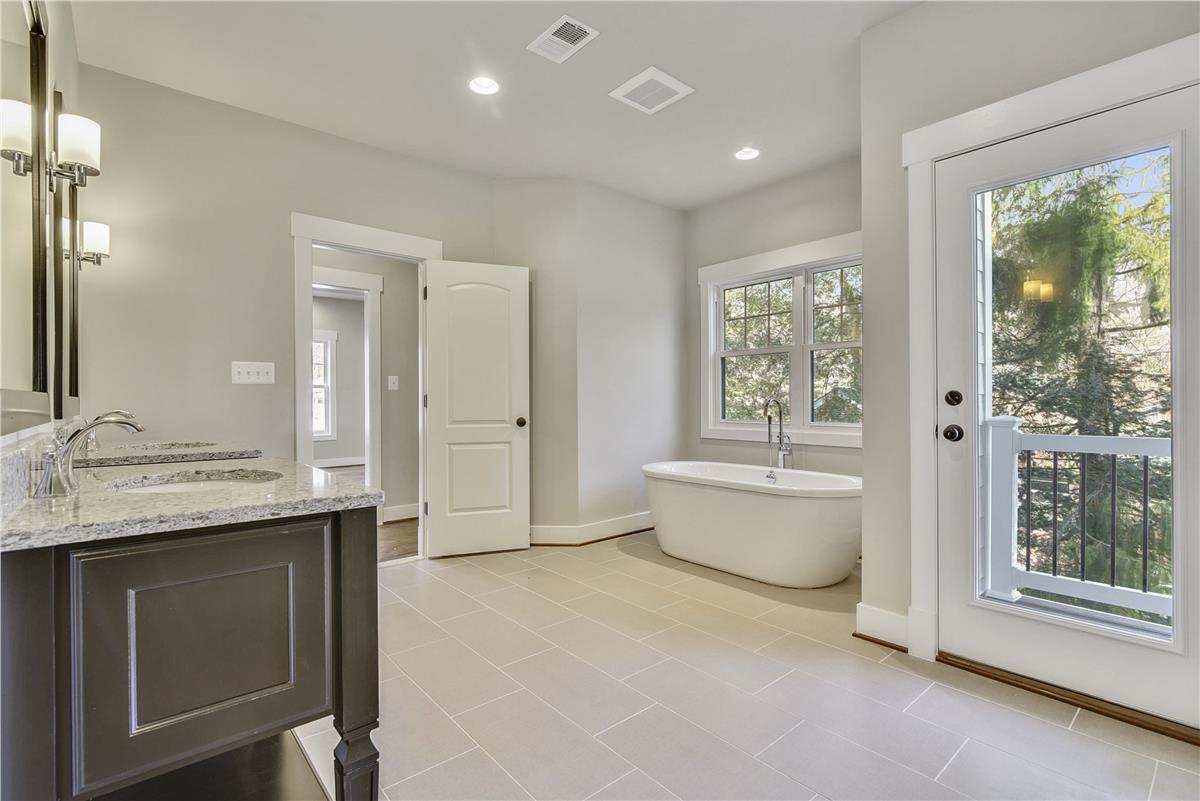
In the Clarendon Model in Falls Church, we upgraded the vanities to separate console vanities.
These particular vanities are made by KraftMaid (same maker of the vanities included in our signature features). They offer a storage shelf (storage baskets or rolled up bath towels would look so cute in that space!) and a roll out drawer inside.
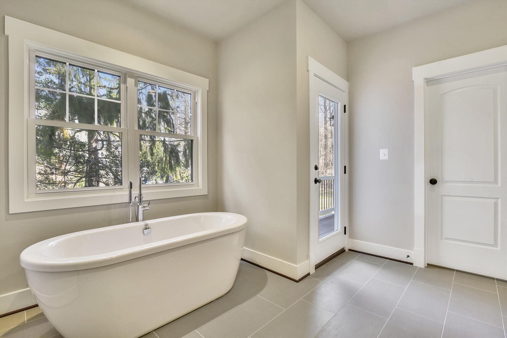
We also changed the tub to a standalone tub. I love this feature because the tub becomes the focal point of the bathroom.
Yep – I do love this home. But as per usual, there are a few things I’d do differently. Nothing major, but given the chance to build this home again, I’d change 3 things. Stay tuned for my follow up post and I’ll share them with you!
In the meanwhile, you can check out a full virtual tour of the Clarendon Model in Falls Church HERE.
Dream Big. Build Smart.
