How I Designed My Master Bath
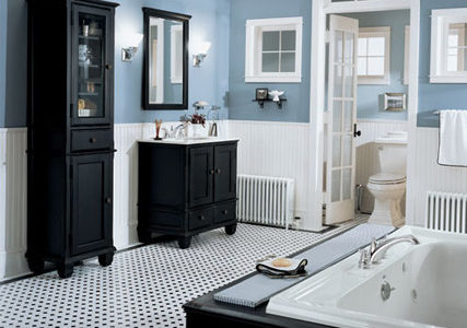
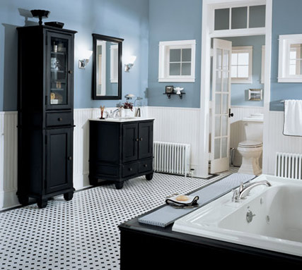
When Paul and I built our home in 2008, I had some definite ideas about how I wanted my bathroom to look. I knew I didn’t want a traditional vanity but rather two separate sinks that “looked” more like furniture. I also wanted a big shower and an enclosed commode. This is the inspiration picture I found during the planning stages of our house…
I loved the retro looking tile and the dark cabinetry and blue paint! I’m definitely drawn to blue when it comes to decorating. It soothes me.
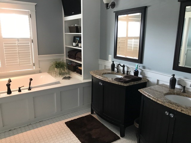
Working from an inspiration picture can help guide your decisions. Find something you love and replicate (or copy but replicate sounds better doesn’t it!). So here is what we ended up with…
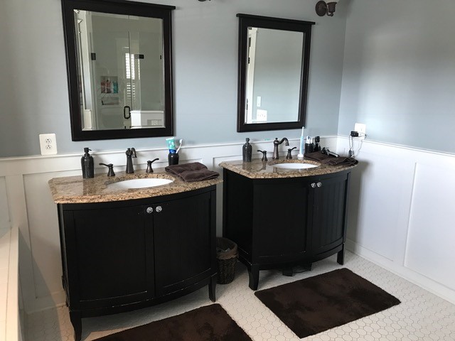
I love these furniture looking vanities. Kraftmaid makes some really nice vanities in furniture style.
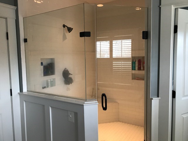
And I love my big shower! And the glass isn’t dirty – the shower was just used!
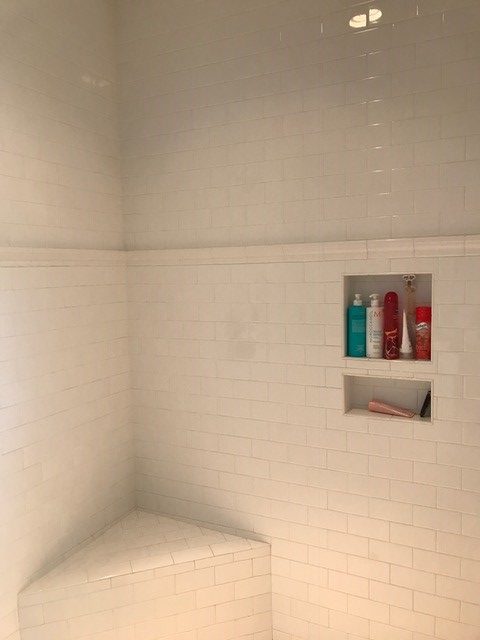
Instead of listello tile, we opted for this simple chair rail. I love how it looks with the subway tile.
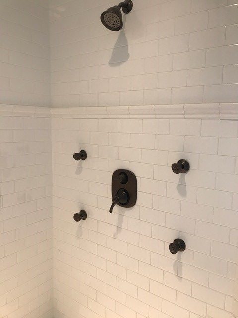
And Paul insisted on this vertical shower system. I thought it was overkill, but can I tell you something? I haven’t showered without it in the nine years we’ve lived in the house. Not once. I love it and can highly recommend. Thank you Paul!
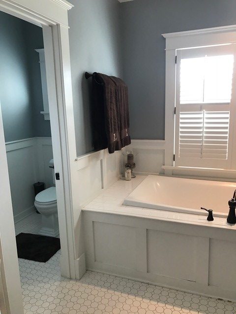
Enclosed commode room – check!
Back to my inspiration picture –
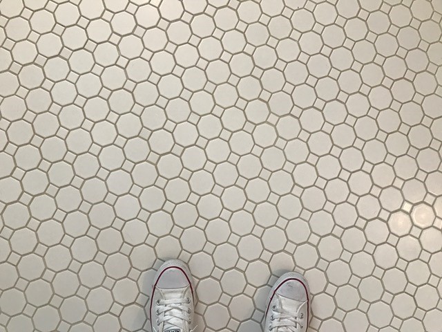
The floor tile is called Octagon Dot. I was so close to going with the black dot (as shown in the inspiration picture) but at the last minute, I decided to got with the white, and I’ve never looked back!
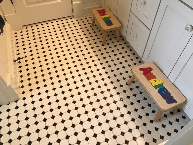
I used the black dot in the boys bathroom so I get my black dot fix in there!
And I didn’t go with a blue blue paint color. Instead, I found a blueish gray. The color is Duron (now Sherwin Williams) Mineral Deposit.
I love it because in some light it looks blue and in some light it’s more gray.
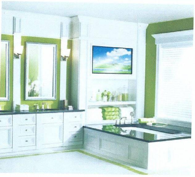
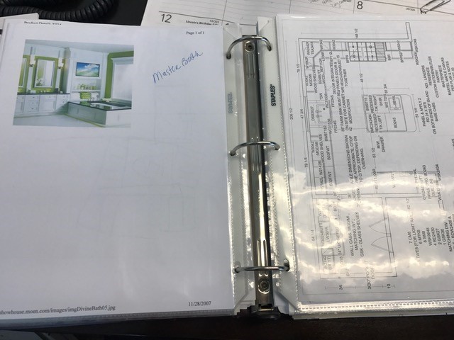
Now let’s talk about the built in shelves. Here is the inspiration picture I used for it.
I had to dig this picture out of my house binder. I put this binder together as we were building our house – it has every plan, fixture, etc….we put in our house.
Including the inspiration for the shelves we built in our bath.
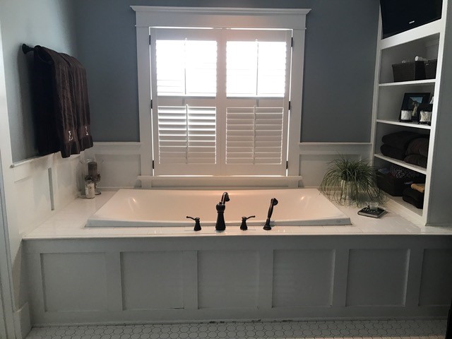
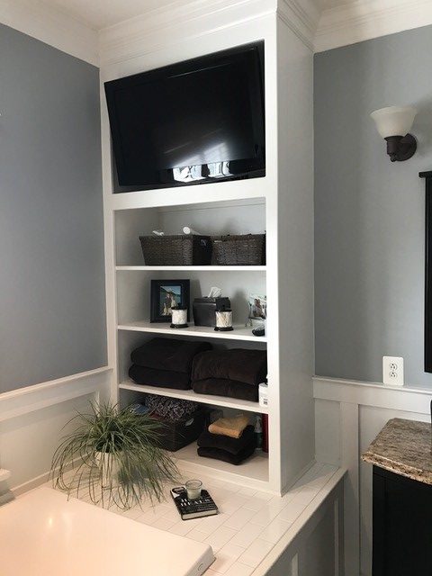
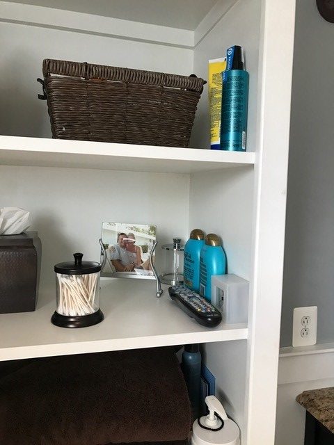
And here is how the built-ins turned out. Love love love!
The shelves are great for storage and want to know a little secret? I tuck a bunch of stuff behind the wall so it’s easy for me to grab, but you can’t see the clutter. Can’t stand the clutter!
After all these years, I still love my bathroom. It’s my oasis (most of the time).
Have fun finding your inspiration!
Dream Big. Build Smart.
